

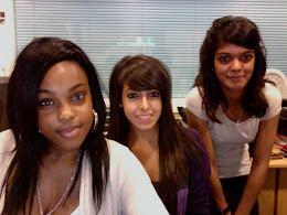
This blog belongs to :
Bianca Albano:4010
Catharrin Ponnudurai: 4660
Patricia Ssemakula: 4786
We would firstly like to thank you for taking the time to look through our group blogs
On the left hand side, you can use the links to see our individual blogs
Our group blog consists of everything we did as group through all the different stages including research, planning and production. Our evaluations are on our individual blogs.
We chose to produce an album cover and a website as our ancillary texts to our music video, which are at the top of both our individual blogs and group blog.
You can use the labels on the left hand side to navigate around the different sections.
Regards
Bianca, Catharrin, Patricia
Music Video completed!
After straightening out the errors from the previous video, we can finally say that our music video is finished.
Here's the video:
Here's the video:
Album Cover finished!
The album cover is finally completed! It's now been sent off to the printers and we're just eagerly waiting for the finished product.
Here's an image of the album cover, including the inside and the back cover.

Here's an image of the album cover, including the inside and the back cover.

This album was created using Adobe Photoshop CS3.
The front and back images were first edited using an airbrushing technique to smooth out Knyt's skin complexion. This was a new technique where Bianca had found a tutorial where it showed us step by step on how to use different effects to create the desired look.
The font that we used was Matiz which we found on dafont.com I chose this font because it was bold and it stood out in order to grab the audience's attention.
I decided to continue on the colour theme of purple and black to create synergy between the various media texts and thus creating familiarity in order for the audience to recognise the similarities easier.
Audience Feedback
Our screening has just been done, and from the audience's response, we're hoping it went well!
Below is a summary of the feedback we received.
 Who would you compare the artist to?
Below is a summary of the feedback we received.
Questionnaire summary
Did you like the song?
Yes: 15
No: 0
Would you watch the video again?
Yes: 13
No: 2
What did you like the most?
· Performers
· Effects e.g slow motion, mirror effects, out of focus shots
· White background
· Structure of the video
· Beginning of the song
What didn’t you like?
- Too much smoke at the end
- Video too simple
- Lack of variety, shots are too similar
- Bianca’s dance routine looked too repeated
- Movement of the performers not in synch with the beat of the song
- Needs more colour
 Who would you compare the artist to?
- Jay Sean
- Tinchy Stryder
- Taio Cruz
- Ne-Yo
Does this resemble a real music video and why?
- Professional filming and editing
- Costume
- Lighting
- Effects
What do you think the key themes are?
- Love
- Dream girl
- Attraction
- Relationships
Average rating out of 10: 8.5
The website is done!
We have tweaked the homepage and added a competitions page as we realised it was needed as there was no-where for us to squeeze in information about the competition.
Here are the final pages of our website with lists of their main features:


Overall, we are extremely happy with the final website and feel that we worked hard on it and have come out with a great, professional looking website which is exactly what we were aiming for.
Here are the final pages of our website with lists of their main features:
INTRODUCTION

- Logo being "written" on screen
- Song being played in the background
HOMEPAGE

- Music video and album
- Large image of Knyt
- Ability to interact (Facebook, Twitter, Competition)
NEWS

- News feed with links to different pages
- Tour dates with link to buy tickets
PHOTOS

- Photo gallery
- Comments box

The screenshot above shows how the audience can click on one of the photos to view it in larger screen.
VIDEOS

- Screen to view the video
- List of the videos
BIO

- Description of him and his life
- Picture of him that fits with the whole "Biography" and reflecting on his life theme of this page
COMPETITION

- Contact form for the audience to enter the competition
- Album cover with "Win Official Knyt Album" banner
- Competition question
STORE

- Links to the online store
- Images of the album and the clothes available to buy
Overall, we are extremely happy with the final website and feel that we worked hard on it and have come out with a great, professional looking website which is exactly what we were aiming for.
Album

Today we recieved our album cover prototype and we're all really pleased with the outcome of the product.
Website Changes
We have been working on our website for a while but there is something that isn't coming together and the look of the website is nothing like we had wanted it to be.
Instead of trying to tweak and change things, we are just going to start a fresh website and make sure this one is created to look exactly how we want it to look.
The only page that will remain the same is the introduction page.
Here is the old homepage:
 This homepage is too simple and the images at the bottom "Become A Member" and "New Single, Knyt Rider, Coming Soon" are screenshots from a video so the quality of the image is extremely bad. The album cover shown on the website is not the finished version and the logos for the stores to buy the album in are obviously taken from google.
These flaws have made the homepage look extremely amateur and that is DEFINITELY NOT the look we want to achieve.
We have made changes to the website and this is what it now looks like:

There is a rotating gallery that shows three images telling the audience about the new music video, the new album and the new single that is coming out soon. We have also got rid of some unnecessary pages that were increasing our workload but were not needed. There is still a lot of work to be done through-out the website but the changes have made it easier as there is now a clear theme that we can follow through-out the pages.
Instead of trying to tweak and change things, we are just going to start a fresh website and make sure this one is created to look exactly how we want it to look.
The only page that will remain the same is the introduction page.
Here is the old homepage:

These flaws have made the homepage look extremely amateur and that is DEFINITELY NOT the look we want to achieve.
We have made changes to the website and this is what it now looks like:

There is a rotating gallery that shows three images telling the audience about the new music video, the new album and the new single that is coming out soon. We have also got rid of some unnecessary pages that were increasing our workload but were not needed. There is still a lot of work to be done through-out the website but the changes have made it easier as there is now a clear theme that we can follow through-out the pages.
Subscribe to:
Posts (Atom)